
WEEKLY BLOGS
1980s Horror
An immense inspiration for me not only as a graphic designer but in all that I create is horror movie posters from the 1980s. I am hugely inspired by the blending of type and image as one and rendering typography with paint in a way that gives it 3 dimensions before 3D type was readily available. The images being so striking yet not a photograph yet usually painted with tempura or oil paint shows the absolute trust in the maximalist and artful nature of these movies even though low-budget B movies were camp and kitsch, it was created with such zest for the film process.
In some instances, the movie posters were thought up by Charles Band for the Full Moon company and then created only then were the films actually given a production and made highlighting the appreciation for the impact the design posters had. Aside from the general ideology behind them, I also enjoy the gaudy and vulgar nature of the imagery and type being completely bashful and over the top almost illegible as I myself aim to create visual artefacts rather than purely functional design and pushing the limit on what can be permitted for graphic design.
In particular, I enjoy the embracing of futuristic ideas using airbrushed luminous glows and striking red text which contrasts posters in the decades before which featured more elegant and clean shape language yet not toned down and as precise as the decades after. I can feel the palpating enthusiasm leaping off the page when looking at them with new technologies and ideas unburdened by large budgets and allowed to be as audacious as they want.

Designer salaries
As a part of this week’s focus in our professional practice module, we looked at the expected salary for a graphic designer. This was very useful since, as much as I enjoy design and illustration, economic factors are important regardless of your skill and passion. I chose graphic design before finishing school as it felt like the natural next step into the world of careers as I adore art and design yet wanted a more practical approach to my process and work and be able to create art and paintings in my work yet also kept as a hobby, and so I’m still finding the balance between my university work and personal work.
After learning more about salaries, however, I’m ambivalent as the salary allows me to become a designer professionally yet below the national average, and so I’m excited I get to use my interest and skill in my full-time job but concerned about experiences or opportunities I might miss on because of a lack of income. Nevertheless, I am still in education and so have begun researching alternative career paths utilising my degree such as teaching or computer-focused design such as a front-end developer, ux designer, or web designer as they offer a significant boost in salary and have always been interested in coding languages and digital design, and so going forward, I will be looking for opportunities to use these skills and look for coding learning experiences as most careers accept a graphic design degree but need to have the relevant skills such as Java or JavaScript and HTML proficiency.
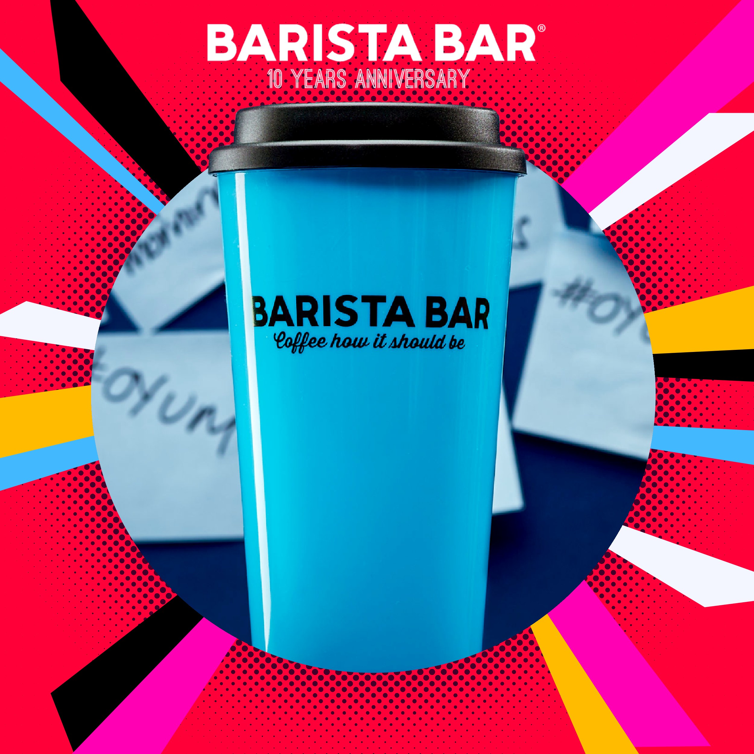
Barista Bar
Currently, I am concluding my work for a client brief that was Barista Bar for a university project, and so I wanted to reflect on my process and how I might improve upon it after having completed an actual design brief from a brand. I found the exercise immensely useful as through completing higher education, I felt as though my skill set and knowledge on design were increasing yet still worried about having to conduct an actual clientele brief in a real-world setting. I knew the necessary equipment and tips from lecturers and speakers but without experience, wasn’t confident in how to actualise them.
We were given a brief and explained it to us in a presentation by personnel in the marketing and graphic design, so in contrast to hypothetical briefs, we were given a direct, specific deliverable to produce. I started my piece how I start all previous projects by aiming to create something conceptual and aesthetic as I feel strongest about my work when it creates shock value and has an artful foundation. However, with this project, my ideas felt forced and struggled to handle the limitations of a functional product. I pivoted my idea to a cleaner design yet still striking, and even though I’m pleased with my outcome, I feel I must begin to work on pushing my work to not only be pleasing to look at but have practicality at the forefront of my design process alongside concept and mood.
Timothy Luke
Timothy Luke is a graphic and visual designer and long time collaborator with the music label PC music, I have touched on his work before in my dissertation yet I was able to delve deeper into his portfolio later, usually I find a designer or artist that inspires me and is a catalyst for change within my own work implementing techniques or motifs to evolve my own style however in this instance I found someone who exhibits the same sentiments as me rather than something new but with more expertise and experience and so I’m very interested in timothy’s work as a guiding point for my own, he said himself how he takes an idea and pushes it to the absolute maximum he can as so similar with the Hyperpop music genre that was produced by PC music itself. He has said he takes a very literal and physical approach to the work by directly implementing the text given literally or matching the visual language to the description or audio of the music. The main thing I appreciate about his work is the mature and dark inspired images but has an immense sense of fun and playfulness as if you can feel the enjoyment he had during the creation of the work in the final outcome itself as the music label is self directed and has a great sense of liberation in taking ideas to the extreme.
Jard1l
Throughout my time in graphic design I have collected many pieces I find inspiring and recently I found out that a large chunk of y inspiration came from the same visual artist that goes by the handle Jard1l on social media who has little information about themselves but they are a part of the tech and digital design studio UOX which is a very experimental studio fully using digital techniques and sleek images. However my main interest is in Jard1l who creates visually stunning 3D modelled pieces of typography and image. Their use of colour and shape is very contemporary almost futuristic yet all have a retro quality to them reminiscent of old video game titles and somewhat childish or tacky yet done in a purposeful way as it thrusted into a dazzling piece with an undeniable grasp of design theory and 3d modelling tools. The techniques shown I have used many times in my work as my favourite portion of the design process is the treatment and textural effects after scaffolding the elements together, I find using 3d and effects used in photography to add a layer of depth and cinematic quality to my work that gives it a huge edge and bolder appearance.

Influences
As we begin crafting our personal brand, I’m aiming to direct all of my design style into a concise and clear visual language to fit the function of advertising ourselves to potential employers and showcasing my own style. My style, as with all others, is a culmination of all our tastes and inspirations, and so I wanted to look at what I have collected into my own personal technique.
Most of my design style has been built outside directly graphic design, as art was an important part of life in my formative years, in particular the art nouveau movement, especially Gustav Klimt. The movement, in itself, I feel is a precursor to graphic design as it bridged the gap between fine art and commercial work in an attempt to beautify anything that can be designed to combat the Industrial Revolution happening around them. The almost overbearing way in which each work is ornamented and beautified to highlight the form over function is something that I continue to be inspired by, trying to make each piece something to remember by and be beautiful.
Stefani Joanne Angelina Germanotta, or by the stage name Lady Gaga, was hugely important in finding my creative voice. She uplifted the queer community and was unapologetically authentic to herself. Even though not a designer herself, her dark, brooding style with an emphasis on hyper femininity and commitment to a high-concept idea is something that permeates through all of my work today. She also introduced me to the work of high-fashion designers such as Tierry Mugler and Alexander McQueen, who use their artistic medium to create a theatrical experience with a focus on horror and sensuality, which are common motifs in my art.